


Color Meter
Color Meter stands out from the competition by its accuracy achieved through its unique utilization of a white paper reference, compensating for diverse lighting conditions. Whether you are an artist, designer, decorator, photographer or just interested in colors, Color Meter is here to assist you.
Color Meter is an innovative app that provides more accurate color measurements by utilizing a white reference to compensate for varying lighting conditions, thereby enhancing precision. Whether you are an artist, designer, decorator, photographer or just interested in colors, Color Meter is here to assist you. Color Meter boasts a diverse user base, ranging from British algae researchers to Japanese hairdressers and Ugandan sweet potato researchers to American color print professionals. This app serves as a very cost-effective alternative to expensive professional color meters, providing predictable and reproducible results, as confirmed by numerous researchers.


Why Choose Our Color Meter
🎯 Superior Accuracy with White Reference Technology
Unlike other color measurement apps that rely solely on camera readings, Color Meter uses a unique white paper reference system to compensate for varying lighting conditions. This innovative approach delivers an accuracy that sets us apart from the competition. While other apps may give you different readings under different lighting, Color Meter stays consistent.
🎨 Comprehensive Color Space Support
With support for over 20 different color spaces and formats - including RGB, CIE LAB, OKLAB, RAL, Munsell, CMYK, and more - Color Meter speaks your language regardless of your field. Whether you need hex codes for web design, RAL numbers for industrial paint matching, or Munsell notation for scientific documentation, Color Meter has you covered. No need for multiple apps or conversion tools.
💰 Professional Results at Consumer Price
Professional color meters costs hundreds to thousands of dollars, putting them out of reach for most users. Color Meter provides the predictable and reproducible results at a fraction of the cost. Whether you're a researcher, professional designer, or hobbyist, you get access to near professional-grade color measurement without the professional price tag.
🌍 Trusted by Professionals Worldwide
Color Meter boasts a diverse and growing user base spanning the globe - from British algae researchers to Japanese hairdressers, Ugandan sweet potato researchers to American color print professionals, French artists to Czech archaeologists. This wide range of professional users confirms the app's reliability and versatility across industries and applications. When professionals trust Color Meter for their work, you know it delivers results.
How to Use
Color Meter is designed to be intuitive while delivering professional accuracy. Follow these steps to start measuring colors with confidence.
A Piece of Paper
Before you start measuring, you'll need a white reference surface. A sheet of standard white paper works well. Avoid yellowed, textured, or off-white paper. The white reference is essential - it's what allows Color Meter to compensate for different lighting conditions and deliver accurate results. (If you prefer, you can also use the Color Meter without the white paper reference, but the result will then be less accurate.)
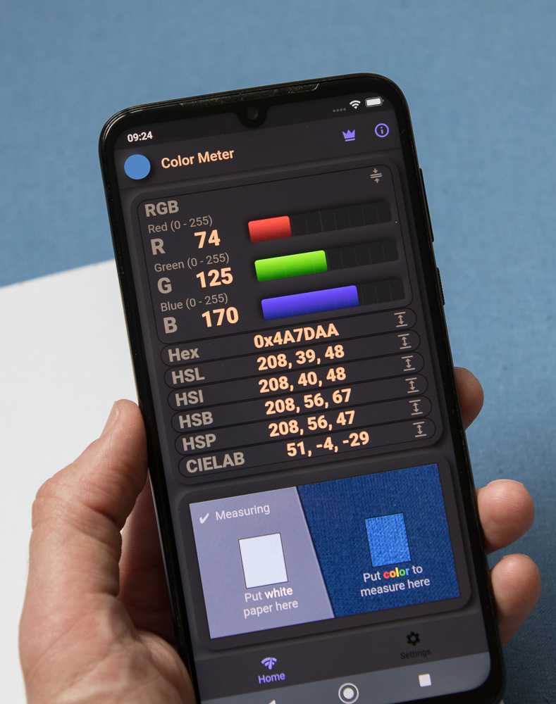
The App Interface
When you open Color Meter, you'll see two rectangles on screen: the left rectangle is for your white reference paper, and the right rectangle is for the color you want to measure. The app continuously reads both areas and uses the white reference to automatically calibrate and compensate for the lighting conditions.
Positioning for Measurement
Hold the white paper next to the surface whose color you want to measure. Position your device's camera so that the white paper fills the left rectangle and the colored surface fills the right rectangle. Both surfaces should be flat, parallel, and at the same distance from the camera. Ensure both areas receive the same lighting - this is crucial for accurate measurements.
Taking a Measurement
Once both rectangles are properly filled with the white reference and your target color, hold your device steady. The app provides real-time color readings that update continuously. Watch for any warnings from the intelligent warning system - these alerts indicate potential issues like shadows, uneven lighting, or missing white reference. When the reading stabilizes and there are no warnings, you can trust the measurement.
Maximize Accuracy
Please try to follow these guidelines to get the best possible results from the Color Meter app.
Use the White Reference
To use the white reference is the foundation of accurate measurements. Use thick, matt and bright white paper - avoid yellowed, textured, or off-white paper. A fresh sheet of standard printer paper works well. Avoid using white plastic, fabric, or painted surfaces.
Ensure Proper Lighting
Lighting quality dramatically affects measurement accuracy. Natural daylight provides the best results - measure near a window on a clear day, avoiding direct sunlight which can cause harsh shadows and glare. For artificial lighting, use full-spectrum LED lights or daylight-balanced bulbs. Avoid fluorescent lights with poor Color Rendering Index (CRI) or colored ambient lighting. The key is that both the white reference and measured surface receive identical lighting - this is even more critical than the absolute quality of the light source.
Eliminate Shadows and Reflections
Shadows and reflections cause larger measurement errors than most users expect. Position yourself and your device so that you don't cast shadows on either the white reference or the measured surface. Watch for reflections from nearby colored objects, walls, hands, or clothing - these can contaminate readings. For matte surfaces, keep the camera perpendicular to avoid glare; for glossy or semi-gloss surfaces, angle slightly to minimize specular reflections. The app's warning system will alert you to major issues, but careful observation prevents subtle errors.
Maintain Consistent Technique
For reliable, comparable results over time, maintain consistent measurement conditions. Use the same device for all related measurements, as different phones have different cameras and color processing. Keep the same distance and angle between camera and surfaces. Use the same white reference paper across measurement sessions. When comparing colors, ensure identical lighting conditions. The app excels at relative measurements - comparing colors measured under the same conditions produces highly accurate results even if absolute accuracy may vary slightly between setups.
Key Features
📄 White Paper Reference Technology
The innovative white paper reference system compensates for varying lighting conditions automatically. This unique approach sets Color Meter apart from other color measurement apps by providing professional-grade accuracy through continuous calibration against the white reference.
⚡ Automatic Live Calibration
The app continuously uses the white reference to compensate for any changes in lighting, ensuring consistent accuracy without manual recalibration. This live calibration assures good quality measurements.
🎨 Comprehensive Color Space Support
Measure colors in over 20 different color spaces and formats: RGB (standard and Hex), Hue/Saturation spaces (HSL, HSI, HSB, HSP), professional color models (CIE LAB, OKLAB), video standards (XYZ, YUV), and subtractive models (CMYK, RYB). Switch between color spaces instantly to match your workflow and project requirements.
🎯 Standard Color Matching
Automatically identifies the closest RAL, Munsell, and HTML standard colors to your measurements. Perfect for matching paint colors, industrial standards, or web design specifications. Eliminates guesswork when you need to specify standard colors.
📊 Delta E Color Comparison
Compare measured colors with professional Delta E calculations (ΔE 00, ΔE 94, ΔE 76). Quantify exactly how different two colors are using industry-standard color difference metrics. Essential for quality control, color matching, and research applications.
💾 Save and Export Measurements
Save unlimited measurements with timestamps and custom notes for future reference. Export your measurement data to CSV files for analysis, documentation, or sharing with colleagues. Build a comprehensive color library for your projects.
⚡ Real-Time Continuous Measurement
Get instant color readings that update continuously as you move your camera. The live measurement mode with automatic warnings ensures you know immediately when conditions are suitable for accurate readings.
⚠️ Intelligent Warning System
The app automatically warns you about potential measurement problems such as missing white reference, uneven lighting, shadows, or other conditions that could affect accuracy.
Supported Color Spaces & Formats
All the following color spaces and formats are supported in the app.
RGB Color Spaces
RGB (Red, Green, Blue): The most fundamental digital color model, displaying values from 0-255 for each color channel. This is how computers and displays natively represent colors.
RGB %: The same RGB values expressed as percentages (0-100%) instead of 0-255, useful for calculations and some design workflows.
Hex (Hexadecimal): The standard web and design format (e.g., #FF5733) that represents RGB values in base-16 notation. Essential for web designers, digital artists, and anyone working with HTML/CSS.
Hue-Based Color Spaces
Four cylindrical color models that separate color into intuitive components: Hue (the color itself, 0-360°), Saturation (color intensity/purity), and a lightness/brightness component:
HSL (Hue, Saturation, Lightness): Uses Lightness where 0% is black, 50% is the pure color, and 100% is white. Popular in graphic design and photo editing.
HSI (Hue, Saturation, Intensity): Uses Intensity as the average of RGB values. Useful in image processing and computer vision applications.
HSB (Hue, Saturation, Brightness): Also known as HSV (Value). Here 0% brightness is black and 100% is the full color. Common in digital art tools.
HSP (Hue, Saturation, Perceived Brightness): Uses perceptually-weighted brightness that accounts for human eye sensitivity (green appears brighter than blue at equal intensity). The most accurate of the hue-based color spaces, for human perception.
Professional Perceptual Color Spaces
These color spaces are designed to match human color perception - meaning that the mathematical distance between two colors in these spaces corresponds to how different they appear to the human eye. Unlike RGB or simple color models where equal numeric differences don't necessarily look equally different, perceptual color spaces are 'perceptually uniform'. This makes them essential for professional color matching, scientific research, and quality control where objective color difference measurements are critical.
CIELAB (CIE L*a*b*): The industry standard for professional color work. L* represents lightness (0-100), a* represents green-red axis (-128 to +127), and b* represents blue-yellow axis (-128 to +127). Designed to be perceptually uniform - equal distances in LAB space should appear as equal color differences to the human eye. Essential for color matching, quality control, and research.
OKLAB: A modern perceptually uniform color space that improves on CIELAB's uniformity. Particularly accurate for color gradients and color manipulation. Uses L (lightness 0-1) and a, b axes (approximately -0.4 to +0.4).
OKLCH (OKLab in cylindrical coordinates): The cylindrical representation of OKLAB using Lightness, Chroma (color intensity), and Hue (0-360°). Easier to work with for color adjustments while maintaining OKLAB's perceptual accuracy.
XYZ (CIE XYZ tristimulus values): The foundation of color science, representing colors as three values matching the human eye's response. Used as an intermediate step in color conversions and professional color management systems.
YUV: Separates luminance (Y) from chrominance (U and V). Originally developed for color television to maintain backward compatibility with black-and-white TVs. Still used in video compression and broadcasting.
Subtractive Color Models
Unlike additive color models like RGB where colors are created by adding light together (red + green + blue light = white), subtractive color models describe how pigments, inks, and dyes create colors by absorbing (subtracting) specific wavelengths of light. When you mix cyan, magenta, and yellow inks together, they absorb more and more light wavelengths, eventually producing black (or dark brown in practice). These models are essential for understanding physical color mixing in printing, painting, and any application involving physical colorants rather than light emission:
CMYK (Cyan, Magenta, Yellow, Key/Black): The standard color model for color printing and press work. Unlike additive RGB colors (light), CMYK represents subtractive colors (ink or pigment) where colors are created by absorbing light. The K (Key) represents black ink. Essential for anyone working with printing, publishing, or physical color reproduction.
RYB (Red, Yellow, Blue): The traditional artist's color wheel used for centuries in painting. Based on pigment mixing where red, yellow, and blue are considered primary colors. While not as accurate as modern color theory, RYB remains important for artists, art education, and understanding how paints and pigments mix in practice.
Color Naming & Identification
Color Names: Provides descriptive names for measured colors (e.g., 'Light Blue', 'Dark Green', 'Pale Yellow'). The app automatically finds the closest matching color name from a comprehensive database, making it easy to communicate colors verbally or in documentation.
HTML Color Names: Identifies the closest standard HTML/CSS color name (e.g., 'CornflowerBlue', 'SeaGreen', 'Tomato'). Perfect for web designers and developers who need to reference standard web colors. Note that the HTML color palette is limited, so matches may not always be close, especially for dark colors.
Industrial Color Standards
RAL Classic: The definitive European color matching system used in industry, architecture, and manufacturing. RAL Classic contains over 200 standardized colors, each with a unique 4-digit code (e.g., RAL 5012 for Light Blue). The app shows the three closest RAL matches with their official names and color codes. Essential for architects, industrial designers, and anyone specifying paint colors professionally. Note: Always verify paint colors visually before ordering, as screen representations may vary.
Munsell Color System: A scientific color notation system widely used in archaeology, soil science, dermatology, and fine arts. Represents colors using Hue (color family like 5YR for yellow-red), Value (lightness, 0-10), and Chroma (color intensity). The app uses the comprehensive e-paint Munsell dataset with thousands of color samples. The app displays the three closest Munsell colors to your measurement, showing both the Munsell notation (e.g., '7.5YR 6/4') and a visual color swatch. Invaluable for scientific documentation and professional color communication.
Color Difference Metrics (Delta E)
Delta E (ΔE) quantifies the difference between two colors using scientifically calibrated formulas. A ΔE value represents how different two colors appear to the human eye - smaller values mean more similar colors. Generally: ΔE < 1 = Not perceptible to human eye, ΔE 1-2 = Perceptible through close observation, ΔE 2-10 = Perceptible at a glance, ΔE > 10 = Colors appear completely different.
The app supports three industry-standard Delta E formulas:
ΔE 76 (CIE 1976): The original Delta E formula, simple Euclidean distance in LAB color space. Less perceptually accurate than newer formulas.
ΔE 94 (CIE 1994): Improved formula with weighted components that better match human perception. Includes separate parameters for graphic arts and textiles. Note: This formula is not symmetrical - ΔE(color1, color2) ≠ ΔE(color2, color1). More accurate than ΔE 76 for most applications.
ΔE 00 (CIE 2000): The most accurate and widely accepted formula in modern color science. Accounts for perceptual non-uniformities in LAB space and provides the best match to human color perception. This is the recommended metric for professional color matching, quality control, and research. Industry standard for paint matching, textile color control, and color-critical applications.
To use Delta E: Save a color as your reference from the 'Saved Measurements' tab, then choose it as your comparison color. All new measurements will show their ΔE difference from your reference, helping you match colors precisely.
Light Reflectance Value (LRV)
LRV (Light Reflectance Value): Measures how much visible light a surface reflects, expressed as a percentage from 0 to 100 (though values above 92 are rare in practice). LRV 0 represents absolute black absorbing all light, while LRV 100 would be a perfectly reflective white surface.
LRV is crucial in architecture and interior design for:
• Building code compliance (minimum contrast requirements for accessibility)
• Energy efficiency calculations (dark surfaces absorb heat, light surfaces reflect it)
• Lighting design (determining how much artificial light is needed)
• Creating visual contrast between surfaces
• Understanding how paint colors affect room brightness
Example LRV ranges: Dark colors (0-25), Medium colors (25-60), Light colors (60-85), Very light/white (85-100).
Note: Use the white paper reference for accurate LRV measurements, as lighting conditions significantly affect reflectance readings.
What Users are Saying in Official Reviews
"Highly recommended!
The application is suitable for archaeologists, I especially appreciate the large selection of color models and the automatic ΔE value for calculating the deviation when repeated measurements are made. I also noted a great agreement with the Munsell scale (when taking pictures in a light box under standardized conditions)."
"Exceptional application
Totally recommendable and reliable!!"
"Perfect for Artists
Value, Chroma and Hue can be measured more accurately using this app correctly compared to any other. For artists trying to match colours I don't think you can get more precise so conveniently. The UI is very intuitive. It's a thinking persons app. Thank you to the developer Björn who responded to my question and is still developing features for this app."
"Very Good
I use the app to measure the colour of creams and lotions in a laboratory, it's saved a fortune in specialist equipment and Munsell card sets."
"Powerful app for artists, painters and designers
This app automatically converts what the camera sees into several tinting code systems, avoiding recording numbers and using separate apps to convert from RGB to CYMK, etc. Access to these codes facilitates color matching for calligraphers, makers, painters, interior designers, model builders and other artists. The addition of a white reference compensates for the change in hues and shades due to lighting variances, and is often not available in similar apps."
"A welcome addition to any lab
In combination with a light pad and camera holder, this app allows clean, simple and powerful data transfers for examining changes in transparent media. This set-up allows a more stable and orderly screening process for planned micro-algae growth and dye metabolism."
"Exceptionally useful for me as an artist. I've already had a surprise at how subtle the differences in luminosity and hue are between flower petals in the sun and shaded petals. It is also very useful for finding the base color of a subject that is in a color that my phone's camera just can't handle correctly, like bright reds that tend burn out or go orange in cam photos. I really would like to see a user forum on your website so that users can share hints and tips."
"Works exactly as one would expect. Very useful for comparing color swatches objectively and testing lighting changes."
"This app is fantastic! I use it to match paint colors using a sample, and the accuracy is absolutely spot-on! A huge THANK YOU to the developer!"
"Perfection, and exactly what I needed! This tool allows you to measure the exact color, in multiple formats (RGB values, HEX, etc). While it is not required, I found the option of a white reference to be ideal! This means that you can add a white piece of paper, or similar, into the frame, and identify it as white. That way, the program can determine if there are any color biases in the light, and can effectively "subtract" that bias color in the light from the color you are measuring."
"When we take a break from indoor shooting and then continue shooting, it's very difficult to get the lights to match. We have to match them in post-production, which takes up extra time. This app has put an end to that problem. I use the app to measure the lights' colors in every scene I shoot and make notes. When we're going to resume shooting, I can use the app to set the lights to the same color."
"Excellent application. In my field of agricultural research, it's very useful for evaluating fruit color changes and the effect of fertilizers on leaf color. Good value for money."
"Top-notch service, questions were answered very quickly. Highly recommended."
"Home repair and decorating is fraught enough without having to argue about eggshell versus linen. It's hard to bring your 96" wood slat blinds into the store for a color match. This app really works, it uses the camera and torch and a piece of printer paper to capture the true color of things and name and print them. It's a miracle."
"It's simple and easy to use. I love it. In one word, it's great."
"Tried a few similar apps, this is the only one that really does what it promises. Would definitely recommend."
"Surprisingly good!
At first, I didn't even believe that something like this existed. After trying the demo, I bought it right away — very useful and works great."
Need Help or Have Ideas?
We're committed to making this app the best it can be. Your feedback matters to us, and we personally respond to every user who contacts us. Whether you have questions, need support, or have ideas for new features, please reach out to us at [email protected]
Wide Language Support
The app has full support for 40 different languages, making measurement accessible worldwide.
![]()
![]()
![]()
![]()
![]()
![]()
![]()
![]()
![]()
![]()
![]()
![]()
![]()
![]()
![]()
![]()
![]()
![]()
![]()
![]()
![]()
![]()
![]()
![]()
![]()
![]()
![]()
![]()
![]()
![]()
![]()
![]()
![]()
![]()
![]()
![]()
![]()
![]()
![]()
Download the Color Meter app now


All the basic functionality of the app is free. To use the more advanced features a subscription or a one time fee is required.